منذ تأسيسنا عام 2005، كنا نؤمن بأن النمو الحقيقي يأتي من التطور المتوازن بين الحفاظ على هويتنا ومواكبة المستقبل. اليوم، وفي عام 2026، يسعدنا أن نشارككم فصلًا جديدًا في رحلتنا – هوية بصرية تعكس تطورنا وتطلعاتنا للمستقبل.
Since our establishment in 2005, we have believed that true growth comes from balanced evolution – preserving our identity while keeping pace with the future. Today, as we stand on the threshold of 2026, we are delighted to share with you a new chapter in our journey: a visual identity that reflects both our evolution and our aspirations for the future.

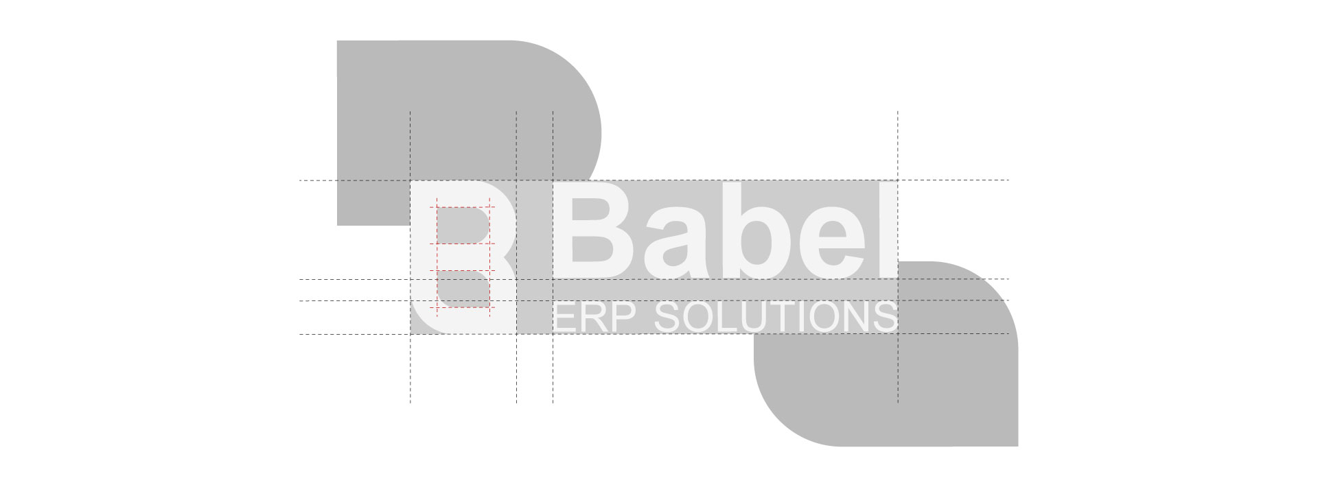
حافظنا علي الجوهر المعروف لشعار بابل. مع تطوير الالوان بشكل طفيف لكي نحافظ علي الاعتراف بالعلامة. كما اضفنا الوان ثانوية أوسع تمنحنا مرونة تعبيرية اكبر. صممنا هويتنا الجديدة كنظام بصري يدعم تطلعاتنا المستقبلية..
Preserved the core Babel logo identity. Subtly refined colors for recognition. Added a broader secondary palette for expressive flexibility. Designed as a forward-looking visual system.
سيد احمد النجار
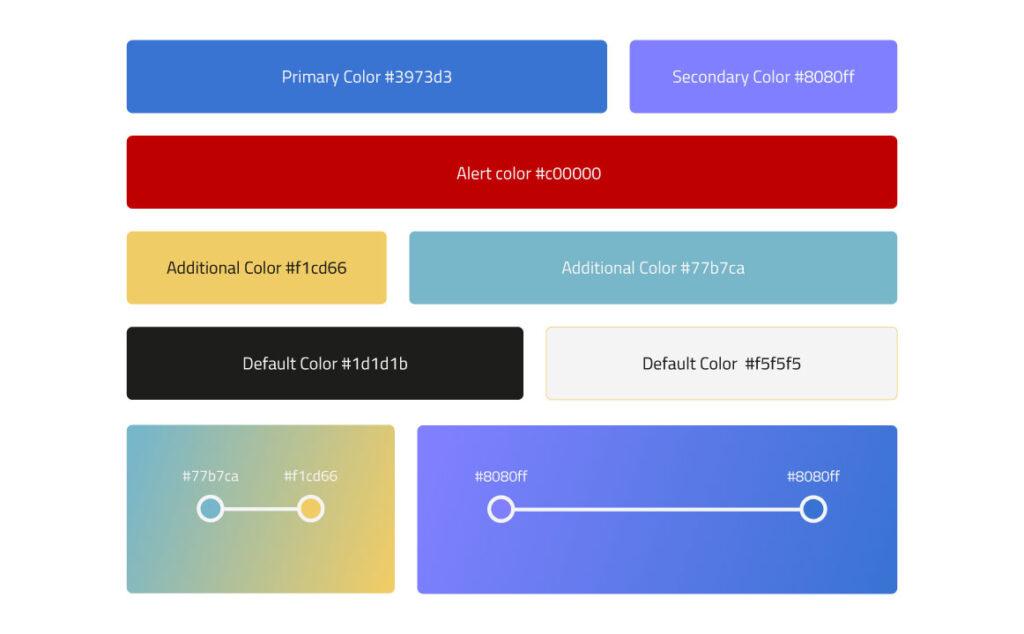
مصمم جرافيكاصبحنا اكثر جرأة في التعبير عن هويتنا عن طريق لوحة الوان اساسية وثانوية تم اختيارها بالاعتماد علي الكثير من معايير تجارب المستخدمين داخل انظمتنا، بالإضافة الي الوان أثبتت وجودها وارتبطت بهويتنا منذ عام 2005 مع اول اصدار للنظام بابل ERP.
We have become more bold in expressing our identity through a primary and secondary color palette, chosen based on numerous user experience metrics within our systems, in addition to colors that have proven their presence and have been associated with our identity since 2005 with the first release of the Babel ERP system.
نحن اكثر إتزاناً الآن..
We are more balanced now.
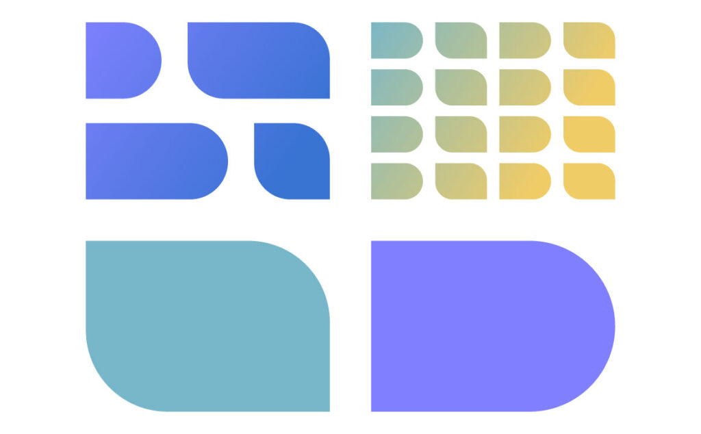
يأتي تصميم علامتنا الجديدة مع اشكال ستراها باستمرار في مادتنا الاعلانية وتجربة المستخدم في انظمتنا. بفضل تصميم شعارنا الذي يجمع بين الحدة والعصرية معاً والزوايا الحادة والدائرية ولدت اشكال تعبر عننا بشكل مثالي. وهو ما يوحي بتطلعنا لمستقبل اكثر انفتاحاً مما سبق.
Our new logo design comes with shapes you will consistently see across our advertising materials and the user experience within our systems. Thanks to a design that uniquely blends sharpness with modernity, and angular with circular forms, these shapes perfectly express who we are. This signals our aspiration for a future more open than ever before.
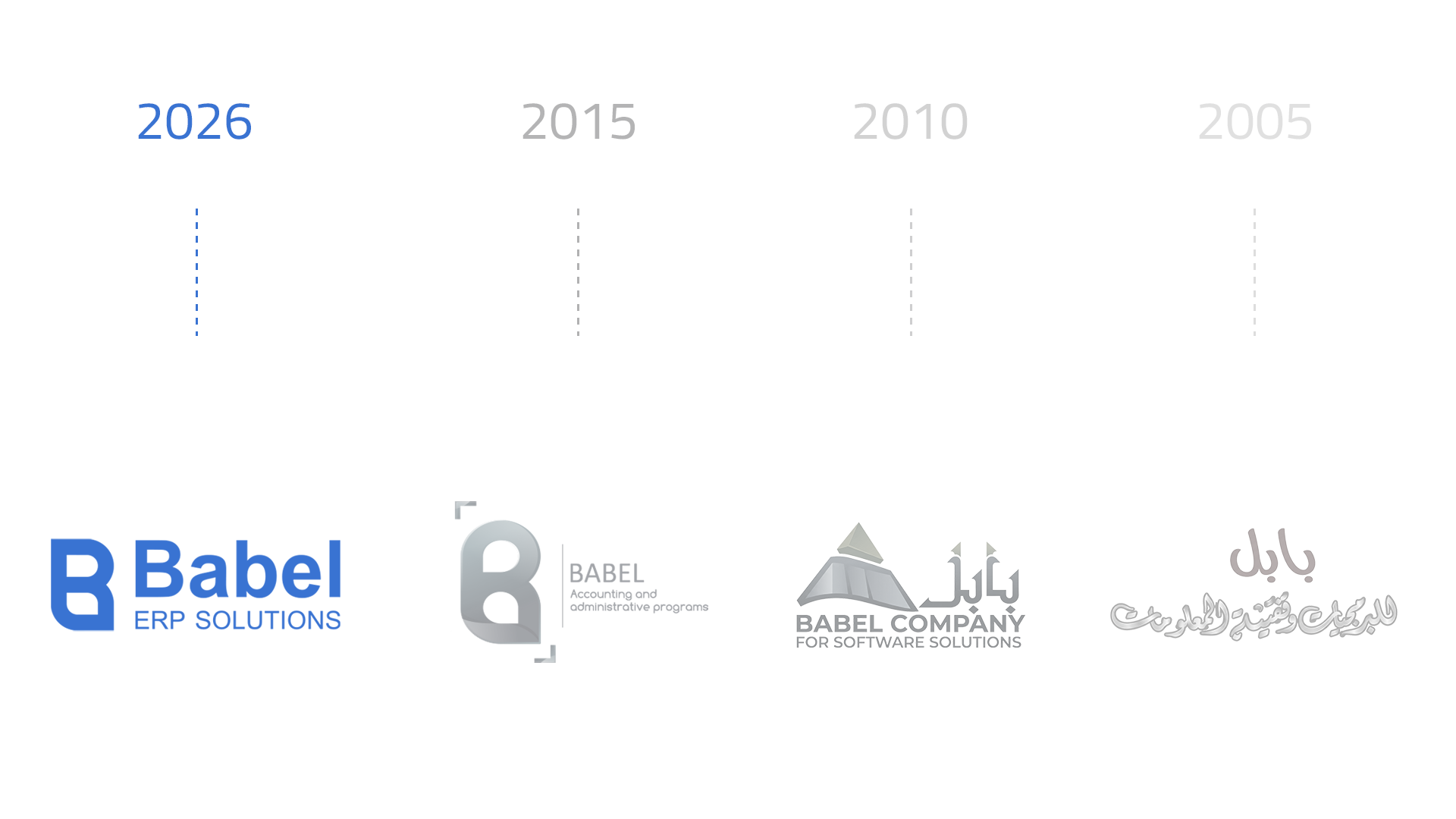
منذ 20 عام مضت علي انطلاق شركة بابل كان هدفنا الاساسي هو تقديم الحلول البرمجية لكافة الصناعات في تصنيف المقاولات والاستثمار العقاري والي وقتنا الحالي نفتخر بثبات جودة خدمتنا ونسعي الي تطوير خدماتنا لتخدم تطلعات عملائنا المستقبلية..
For 20 years since Babel’s launch, our core mission has been delivering software solutions for the construction and real estate investment sectors. Today, we take pride in our consistent service quality while continuously evolving to meet our clients’ future aspirations.

محمد نجيب
المدير التنفيذيThis update is a step forward that honors our successful past, evolving to serve you better.